
indeed
Prospective Client
ROLE
UX DESIGNER
TEAM
EMMA VENDETTA REIMERS
TIMELINE
5 DAYS
YEAR
AUGUST 2023
Indeed is a leader in the job search industry. It is currently being rapidly out-paced by LinkedIn, which also has a mobile app and has a premium subscription service. My redesign of the functionally-challenged Indeed app makes it a true competitor and offers new subscription offers to users while preserving key insights and leveraging the familiar card-swipe interaction of dating apps.
PROBLEM AREA
Indeed is a leader in the job search industry. Dealing with its mobile app interface, however, is a job in and of itself. The current mobile interface is bland, text heavy, and leaves a lot to be desired in terms of features.
1
Test app myself and explore key features, gaps, and issues.
Design Process

I started by exploring job opportunities on Indeed and quickly became frustrated with the lack of functionality and poor interaction design with what seems like a wealth of data on Indeed’s part. I noted the key issues and initial possible solutions.
Serious issues included :
all past searches stack up
no color differentiation between pages
location search is singular instead of multiple
mixed levels of detail from different companies and positions
2
Gather user experience data on main issues of mobile interface design.
I then turned to reading reviews on the App Store for Indeed. While it is generally reviewed positively for its content (aside from the increasing frequency of scam job listings), it lacks functionality in some easy-to-fix areas.
I find 2 and 3 star reviews to be the most helpful in terms of providing productive feedback. I also looked across multiple years to see what issues were still plaguing app users that hadn’t been adequately addressed by past updates and bug fixes.


I pulled the text, star rating, and dates of 30 randomly selected reviews into Google Sheets and did some data cleaning before I qualitatively coded them in Nvivo. Open axial coding reveals 4 key ongoing issues:
inability to specify search terms using Boolean style search (excluding certain terms or types of jobs, requiring certain combined words)
failure of filters to actually…well…filter
scammers using posts to scrape data from users
repetitive screening tests with responses that are set per role rather than per user
+


3
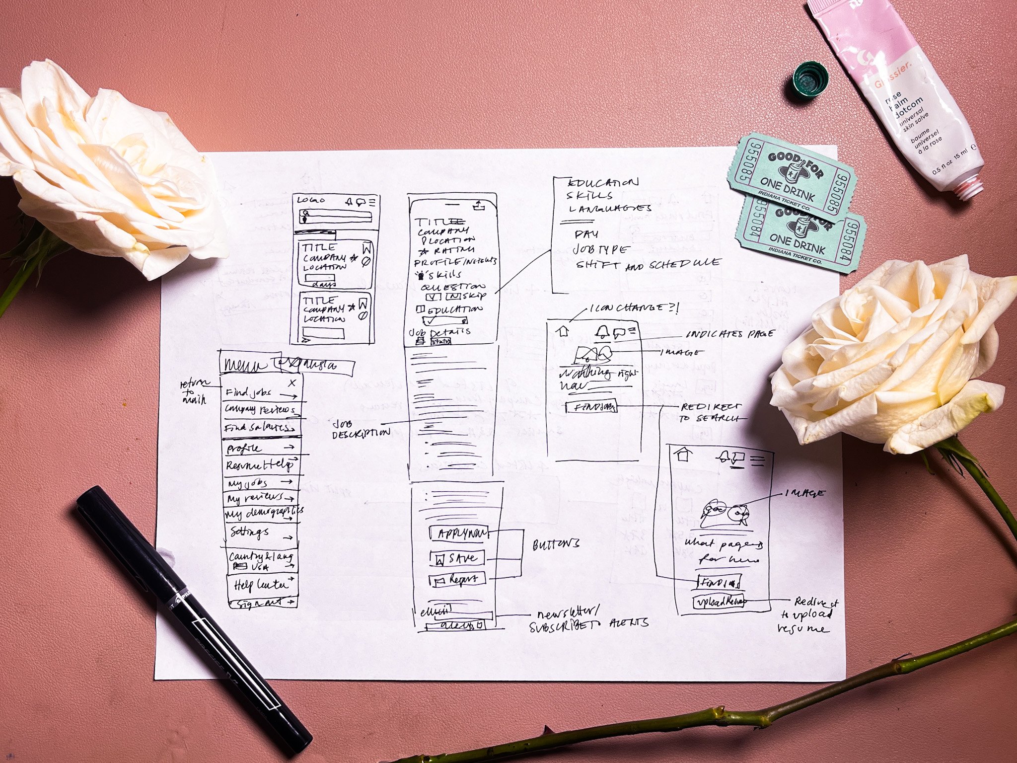
Sketch initial solutions.
4
Design new visuals and wireframe new interactions.


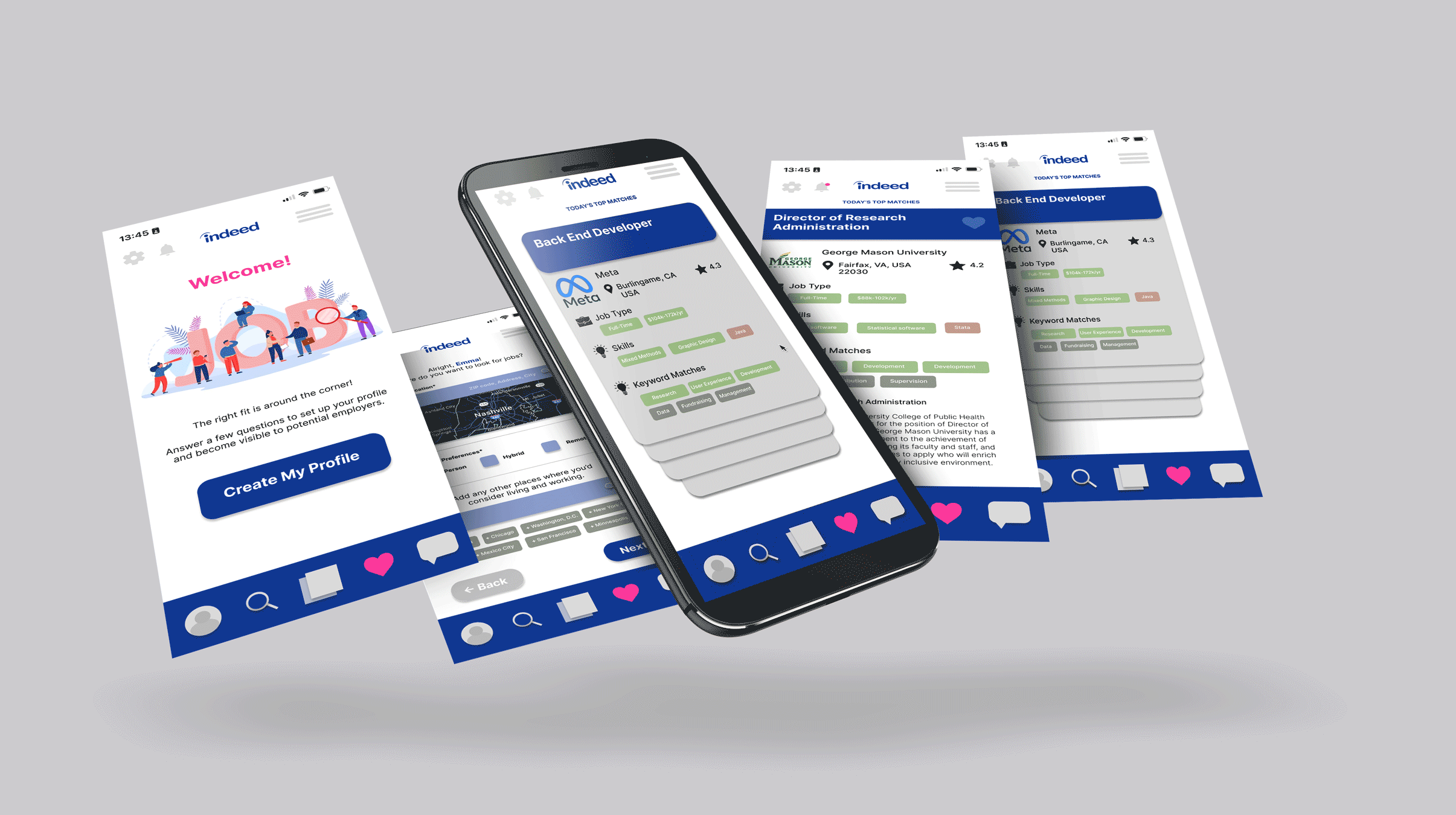
Swipe to Match
My final wireframe in Figma has users swipe left (to dismiss) or right (to view) top matches based on a developed user profile. This was inspired by the proliferation of swipe-to-match interactions originated by Tinder in the dating app industry. Essentially, the job search world is much like the dating world: there are certain known factors (height, religion, sexual orientation) that can be treated as discrete filters and others (images, question responses, messages) that must be treated as qualitative variables with some room for negotiation. This feature allows Indeed to offer a premium subscription to users who would like to use their database and AI to get access to more than 10 Top Job Matches per day.
User Profile
The user profile builder asks many of the questions that are redundant in the existing version of the app, but treats those as higher level questions which apply to the overall job search for that user. The user can select multiple locations and save those for their overall search. They can also go through and check off their skills from a comprehensive list, populated using AI recommendations based on the skills they have already checked. The user profile includes preferences on relocation, compensation besides salary like mental health and parental leave packages, and allows the algorithm behind Indeed’s recommendations to get more granular data to make increasingly better matches for users. When a top match has a 80% higher match according to the user’s profile and a user dismisses it (swipes left), the user will be prompted to respond with why they didn’t think it was a good match, much like a rider of Lyft is currently prompted when the ride is finished if lower than 5 stars is given in the review. This provides additional feedback and fine-tuning of the algorithm for user-job matching.
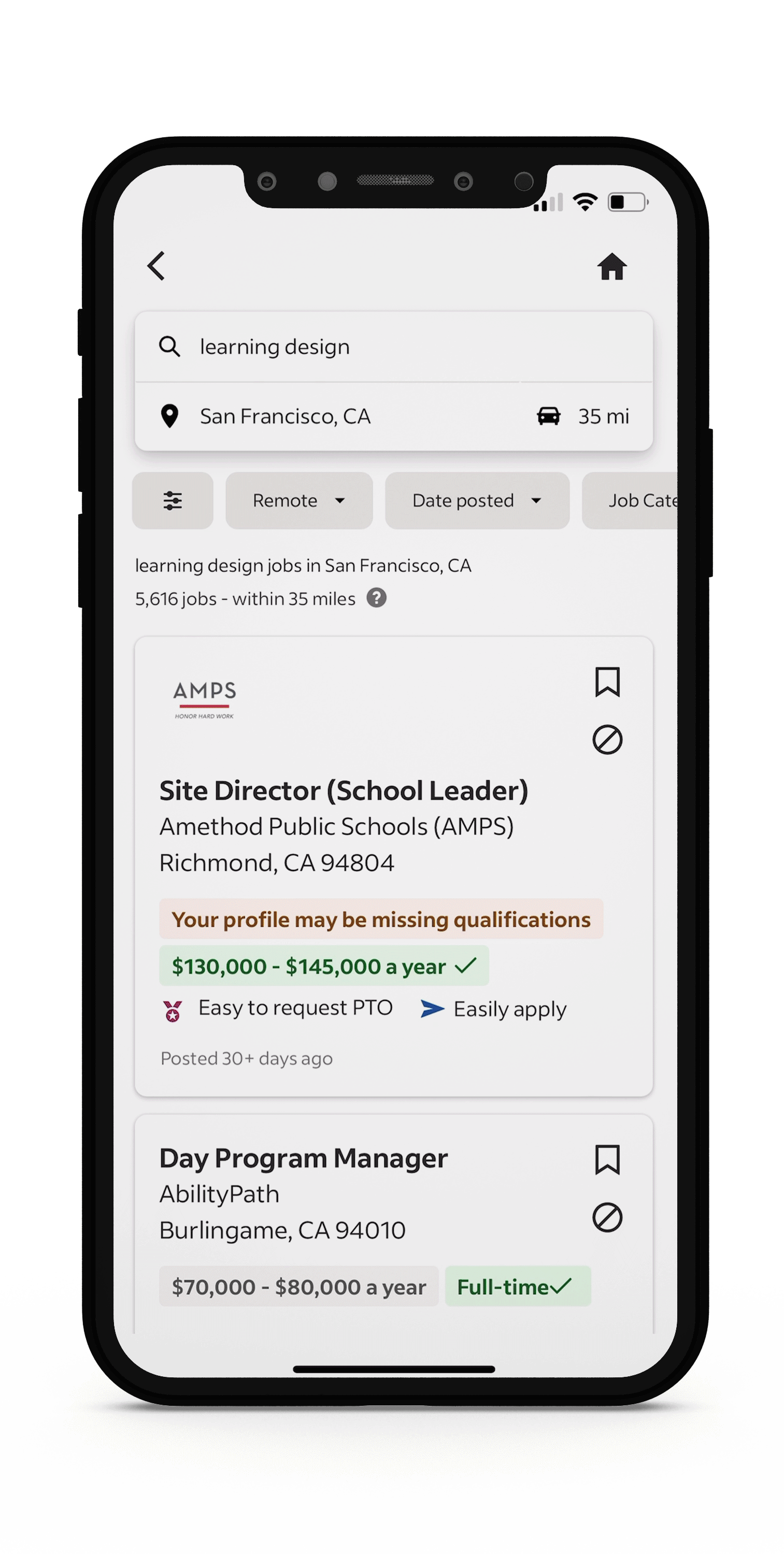
Saved Searches
My version gives users the opportunity to save searches, not just register for separate email alerts. A Saved Search includes parameters of location(s), remote/hybrid/in-person, skills, pay, benefits, education, language requirements, and prioritized sorting based on recommendation (AI matching), compensation (AI analysis of pay and benefits package, rated based on comparable listings), distance (from current location), and days since posting originated. This was inspired by the saved search feature on EBTH’s (somewhat buggy but ambitious) app.