Courtney’s Wedding Invitation
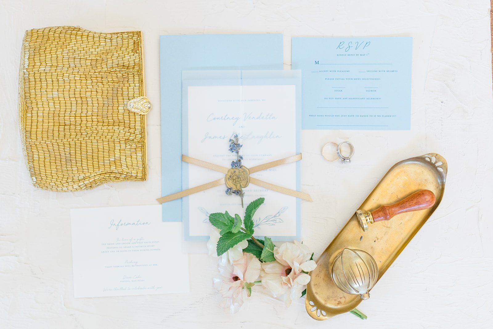
When my mom got engaged, I was delighted that she asked me to do the invitation suite. We landed on a delicate blue, inspired by hydrangeas and lavender, and added antique gold accents. This paper suite featured an RSVP card, pre-stamped response envelopes, hand watercolored envelopes (by my sister, Camille), and an information card alongside the main invitation. The main invitation was, of course, all decked out: two layers of paper for the base, a vellum trifold enclosure wrapped with a gold ribbon and sealed with gold wax pressed into a piece of dried lavender. It looked good. It smelled good. It felt good to hold. Whew! Y’all. This invitation suite: she’s a beauty.
Kimberly Macdonald Photography
Not included in this display—but still a part of the wedding set—was the invitation to the Friday afternoon party at my mom’s long-time dear friend Lynn’s home in Tiburon (if you know, you know…that the views from here are breathtaking). Each square was printed, then the gold stars were hand-painted on before adding the printed vellum layer with a ribbon tie at the top.


The catering from Just Relish was incredible, so the simple, classic style of the menu let the dishes shine on their own.

Kimberly Macdonald Photography

Kimberly Macdonald Photography
My sister—the apparent genius—had the idea to get my mom a Yves Saint Laurent lipstick with her new name engraved on it.

Kimberly Macdonald Photography

Kimberly Macdonald Photography
Place cards and table cards were both watercolored by hand to match the envelopes from the invitations. Yes, Camille did all of the flowers. Did I mention she’s a professional florist?

Kimberly Macdonald Photography

What do you think? Would you include some of these elevated elements in your own wedding invitation suite? We do custom orders!
xo,
em