Luxurious Bohemian Main Bedroom for under $2k
If you know me, you likely know that I strongly prefer to buy things gently used rather than new. It helps me spend less, it reduces waste, and it usually means I find pieces that are unique and charming. I love Facebook marketplace—it’s the only reason I still have any social media account. I’m also a Craigslist fan, but you do have to be a bit more careful there (we like Facebook marketplace’s built-in social accountability that other sites lack). I also scour estate sales, online emporia, yard sales, and thrift shops looking for the perfect pieces to help bring my home’s style together.
Not only do I really prefer this method of shopping, but I’m damn good at it. We’ve found incredible things over the years, some used and some new, for a fraction of the price they’d cost new or even of their value at a vintage market. Since I only have so much room in my wee house and lots of great finds, I’m sharing them with you, reader.
Can you help me with my home?
The answer is YES. We can help you do “bougie on a budget” too! Since my sister Camille is a professional organizer and stylist and since we do commissioned in-home murals together, if you want to hire us to outfit your home, you can! Drop me a line via the contact page, let me know your budget and goals, and we can get working. For a fair hourly rate for our design and acquisition services, we’ll help make your dream home decor a reality. From painting to making sure you actually print and frame that photo, together we can turn any space into your place.
If you’re in Nashville, we will help coordinate the negotiation of prices on your marketplace items, the pick up of said items, and the installation of your pieces in your home. If you’re not located in Nashville, we’ll do a series of virtual consultation appointments where we help you learn our tips and tricks when choosing your own pieces as well as provide you with a smattering of options in your local market.
Luxurious Bohemian Main Bedroom
Here is a complete bedroom, styled and put together for under $2,000. Spoiler alert: the most expensive thing here is the brand new mattress.
Room: Main bedroom for one or two adults
Style: bohemian, retro, high texture
Colors: grey, black, tan, cream, rust, rose
Materials: iron, linen, wood, rattan, faux fur
$155 Vintage rug bench
Style with black sheets ($45) , cream duvet set ($100), queen mattress ($400), duvet insert ($30), and high quality main pillow inserts ($60).
Style by replacing the original handles with black pulls ($10) and gently refinishing the top veneers.
Style dresser with a lamp on each side and the rattan tray in the middle filled with trinkets. Center artwork over dresser across from the bed.
$180 vintage rattan chair
(from bed)
Style chair in corner of the room with mirror near it against the wall. Snag one of those Anthro pillows from the bed to accompany the two faux sheepskin shag pillows and complete the look.
The grant total: $1,940. The value of this room is estimated at $4,500. That’s a savings of nearly $2600! More than double! So now you see why you might want to give me a call.
Why It Works
Your bedroom should be an oasis of comfort, a place where you feel restfulness wash over you as soon as you cross the threshold.
I’ve paired cozy faux fur with the clean and classic linen headboard and duvet to add some softness to the bed. The iron bed frame frame provides a connection point to the black MCM dresser while adding another textural detail of the metalwork. I would paint the wall behind the bed a charcoal grey to bring some depth to the space. (You could go all grey if you wanted to really make a bold statement while still keeping your room like a cozy cave. Contrary to popular belief, a dark wall color can actually make a room feel bigger, not smaller).
The Persian style rug, Anthropologie spotted pillows, and Southwestern inspired vintage rug bench carry the dusty rose and rust colors throughout the room while each adding a unique twist on pattern. Matching patterns like this can feel risky, but it’s what gives your space a lived in, eclectic vibe.
The MCM dresser echoes the actual midcentury nightstands while they’re otherwise contrasted by color. I would swap out the original nightstand pulls for some black iron ones to match the dresser and the bed frame.
Add some fluffy pillows to your newly found vintage bamboo and rattan chair for a funky, cozy 70s vibe that ties in with the wood of the nightstands and the neutral tones of the matching lamp pair.
Feng shui suggests that we not put the mirror across from the bed, so instead I’d situate it in a corner paired with the bamboo chair. The large abstract art creates a colorful statement over the dresser.
What do you think? Could you see yourself snoozing in this room?
xo,
em
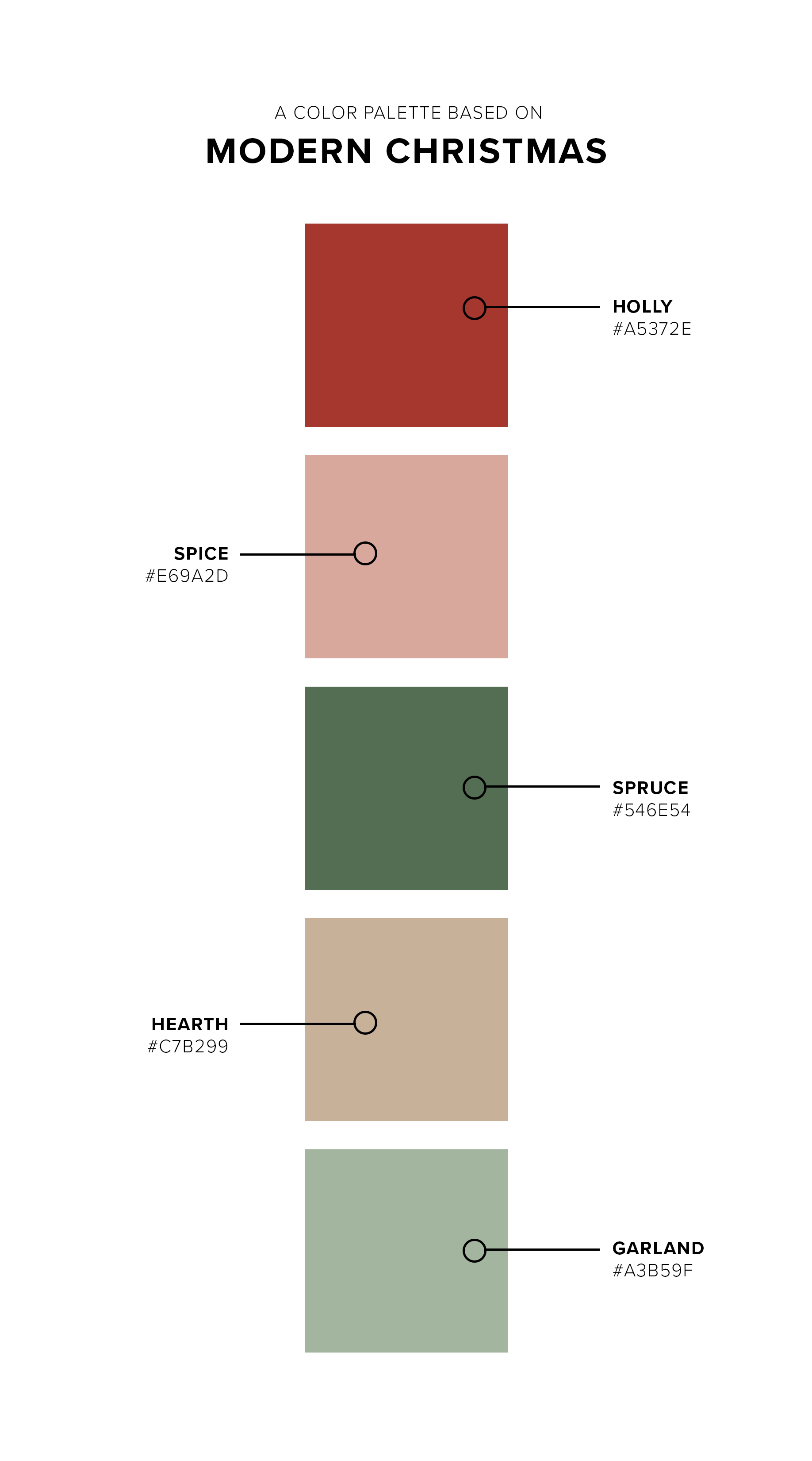
Gemstone Color Palette
Summer brings saturation. Heat pushes us indoors or to water, tomatoes burst with ripeness, and we squeeze the last few drops of extra free time out of our summer schedules before autumn sets in, school returns, and the holidays are upon us.
How To Design a Scientific Poster, Part 1
In this 4-part series, I’m going to be dishing out the design details on how to take scientific ideas and communicate them in a poster without committing egregious visual sins.
There are SO many posters at so many conferences around the world that suffer from confusing colors, lack of structure, too much text, spacing problems, oversharing. I could go on. And I will.
I’ll be walking through several redesigns of a scientific poster that my cohort friends made in 2019 and we redesigned together. We’ll look at the pros and cons of their initial drafts and then examine the changes that we made together to get to the final poster.
By the end of all 4 parts, you should have a grasp on what to consider when you’re first laying out your poster and how to troubleshoot some issues that may arise as you start to add your information. In part 4, I’ll give all my best tips and include a Google Slides with some basic templates.
Instructions I gave my cohort before we started the process:
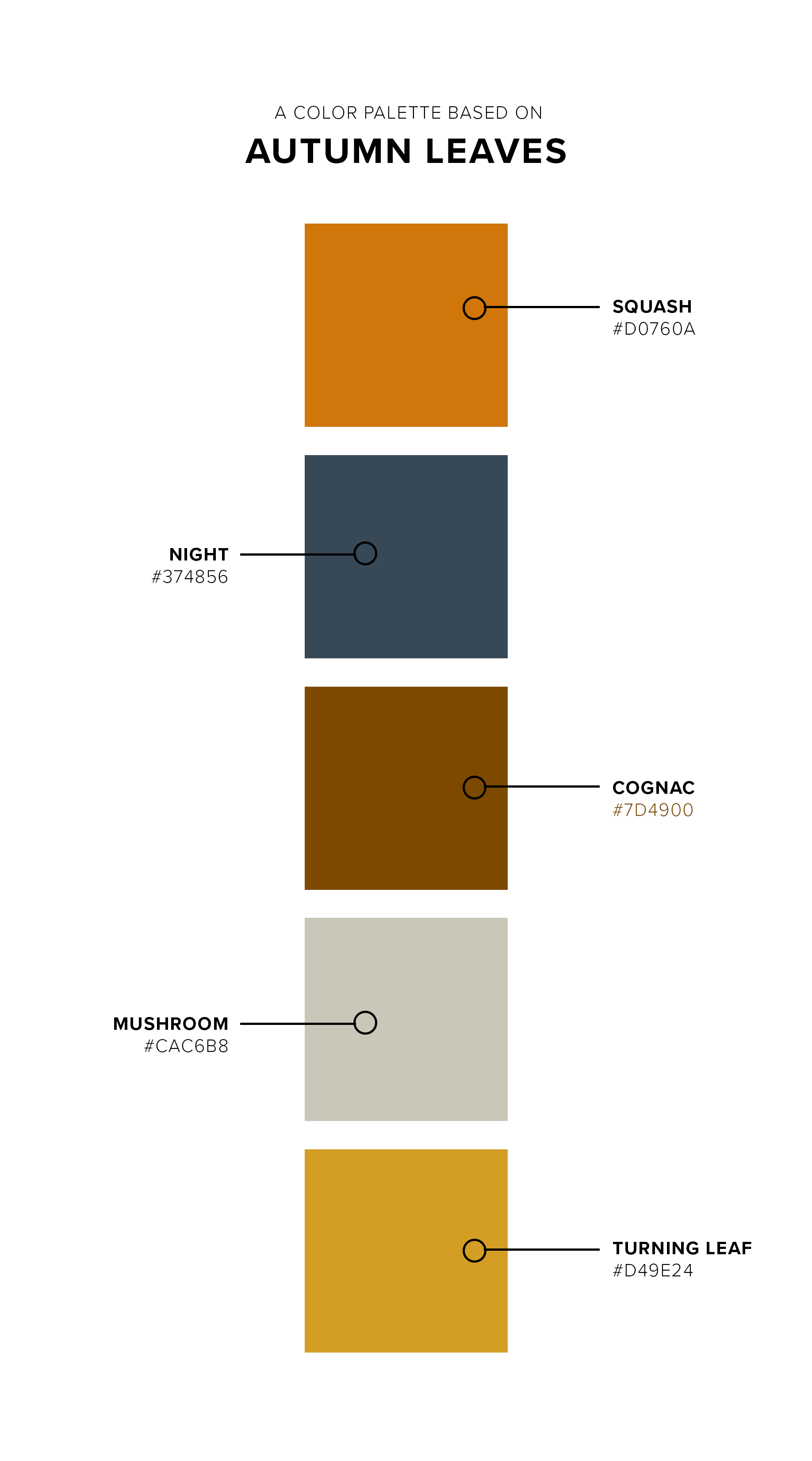
Pick a color palette. Use the hex code (a 6-digit code that starts with a #) to ensure that the colors match and are consistent throughout. You can use a color picker extension with your browser (for those who use Google Chrome) and select colors from a favorite Pinterest image of a color palette. If you need some inspiration, head over here. You will use the colors to consistently and meaningfully signal related concepts throughout your poster.
Use the central space for your findings. We’ll get deeper into why your poster shouldn’t necessarily follow the flow of a paper, but for now it suffices to say that the middle part of your poster is what will catch most people’s eye first. Put the information you want folks to walk away with there.
Add a QR code. I’ve never seen a poster with too little text. But with the classic problem of too much text, you can get away with off-loading extra documents (e.g. a handout you used for the design that you want to show to poster-viewers) into a Google Folder attached to a QR code. The reason I say Google Folder is that once you’ve made a QR code with a free QR code generator, if you want to change what it links to, a drive folder is your best bet. You can use a cloud host of your choosing, but trust me when I say this solved so many potential headaches as people made edits.
Give your audience a visual representation of your data and/or findings to look at. It can be an image you have permission to use from your research footage or a cartoon-style strip where you reimagine the scene illustrated. It could be a large chart or flow. Whatever it is, it should more immediately communicate the idea of your poster to your audience than the text.
Laura’s First Draft Poster
Let’s start off with what’s great here:
Laura followed my instructions regarding choosing a color palette and putting her findings in the middle. She also has a QR code in the top right corner and has chosen to represent a scene of dramatic improvisation from the research study in stick-figure cartoon fashion for her viewers. Yay! All of these are good things.
Laura color-coded her text as it relates to the colors of the key concepts she flagged (“variation”, “(non)rational subjectivities”, and so on).
Laura’s references are in a small font, since only folks who really want to know the source will be reading that section, and she used endnote numbers to indicate that the text is citing a source.
Can you guess what we focused on changing?
Laura has too much text here. She said as much when she sent it. Most often, when I work with researchers and students who are developing a poster or presentation, the text stays in draft form in a Google Doc until about a week before the product or presentation is due. This helps us make any last minute changes without having to restructure the poster (she can update it live and I can see any changes and make those in Photoshop or InDesign accordingly). Laura wanted some help paring down what she had to know what I felt as a reader was the most important for getting her point across.
The images of the actors are inconsistent in style. Laura told me that this was actually intentional! We ended up keeping this in the final design as the movement from stick figure to outlined cartoon person was representative of the increasing complexity of character development throughout the scenes.
The research questions are currently in two places. We only need to see them when they’re about to be answered.
Paragraph forms of text are intimidating to readers who just walk up to your poster and want to know the gist of the research. Bullet pointing that can reduce the scary factor and invite more folks to read your poster.
Laura’s Edited Poster
You’ll probably notice that this poster immediately feels different. That’s because we created more white space and used blue-grey boxes to delineate that space. We rolled with these cute, simple speech bubbles for the headers because the resonated with the rest of the theme of the research: improvisation and speech.
We avoided outlines at all costs. They’re just boxes that want to be filled in.
We gave ample space between each of the elements. White space is your friend. Too much white space is overkill, but honestly I’d take that over crowded text any day.
We stuck to columns that are about newspaper width. Your brain thinks its reading much faster when it gets to move down lines quicker; hence a newspaper doesn’t print a story straight across the full width of the page, but breaks it up into little columns to make your brain happy!
We used the drop shadow effect and different opacities to add depth to the poster. Your brain remembers what it reads on paper better than it does in digital form. Whether you’re presenting digitally or physically, adding some depth and 3D-ness to your image will make it more legible and memorable.
We moved the research questions to be directly over the findings that corresponded. Duh!
We used the bottom margin of the poster’s white space to squeeze in the references. They didn’t need to be their own squared off section and putting them on the white space makes them feel more backgrounded.
We used all caps for headings to direct the eye. We switched the body text to a serif to add some contrast and complexity to the poster without making it any more crowded.
Clever readers will catch that in this draft, the arrow for “Multiverse/Pluriverse” still needs to be made green to match its box. You’ll also notice that the cartoons were not yet added into this version because Laura was playing around with a few of the figures in a separate storyboarding program before she sent them to me for the final version.
How would you rate the readability of this poster?
Personally, I’d say it went from about a 3 to at least a 7 or 8. Some of the text lines are a little bulky, but in a way that we were ok with when we went to print. You can’t win ‘em all, especially when the words you’re using are super long or you have to explain in-depth a gnarly theoretical concept.
xo,
em
5 Essentials to Include in Every Service Quote (plus a free download!)
When I started freelancing in college, I had zero idea what I was doing. I mean, c’est la vie, no? That’s how most of us digital folks start out. But I’ve learned a lot in the last decade or so about the dos and don’ts of running your own business and providing digital services and products. I’ve always loved getting started on new projects and turning around quotes to clients, working to find a timeline that suits us both. Here are five things that you must include in your quote as a professional designer. Plus, scroll down to find a services quote template I created just for you.
1. Your contact hours
Having your contact information and theirs on a quote is pretty standard stuff. But adding indicating your preferred contact methods and including your hours of availability? This is clutch! Just because you’re a freelancer or a small business does not mean that you are on call. You’re not in emergency medicine. You do not wear a pager (your cell phone is not an appendage). Put your work hours on your quote and indicate how long you take to respond to inquiries. It’s called boundaries.
2. Separate line items for taxes
While you’re itemizing all of your services and associated costs, it’s important to clarify how taxes come into play. Make sure you create a subtotal for all service items, then add a line item for your state taxes that apply to sale of goods and services (in Tennessee, it’s a whopping 9.25% so it’s especially important to be up front about the cost this adds). This way, your client knows that you’re not up-charging them randomly and you’ve got your taxes covered rather than having to take them out of your overall income.
3. Payment schedule and options
Life happens. People forget that they were supposed to put that check in the mail or that the project is nearly done and it’s time to pay up to receive the goods. My solution? Include a payment schedule with your quote. I tend to ask for a 25% deposit upon signing of the quote, then 25% upon delivery; the middle 50% can be split up however you like. If you have a client who needs a payment plan, this is the place to work that out. Clear payment schedules help you and your client be on the same page and avoid any awkwardness around the exchange.
4. Terms and conditions of delivery
If you don’t stipulate (aka plan ahead), you’ll be stuck wishing you had. I’ve been here. Learn from my mistakes! Include something about when your payments are due and what happens if they’re late. Include something about your right to revise the quote if the project exceeds the original scope of work (this tends to be—and should be—an ongoing conversation with the client). Then don’t forget a piece about termination of work (if it doesn’t work out). You might also consider including who owns the rights to templates, images, or photos used or produced as a part of the work. You could even put something in there about your editing policy. Personally, I find folks notice a misspelled name, need to add one more team biography, or want to adjust the color of something within a week of delivery.
5. A space for both parties to sign
This is an essential component that I didn’t start including until I ran into issues with the above sections (really, payment and scope of work, but those are war stories for another time). Sign on the line, baby! It’s a helpful tool to have even if it’s a formality. Plus, we like when everything is official.
Additional Items to Include:
I’ll detail more about these in a future post, but here are some options that I’ve included depending on the project:
Change of leadership clause: if you’re working with a client on an on-going basis and the company structure changes significantly on their side, it’s important to have an opportunity to reassess the relationship and know with whom you’d be working as a contractor or freelancer.
Timeline: If it’s a larger project (50+ hours), I include a timeline of when we’ll have meetings or check-in points along the way, what I expect to be done when, and when their “homework” (photos from a staff page shoot, etc.) are due to me so that I can work with them.
Artwork release: Who owns what is always important! Protect yourself and your client in copyright terms by clarifying who can use what images are produced as a part of the project and for what future uses.
Design draft fee: No good designer works on spec (speculation). Creative work isn’t free! If you’re a client thinking of hiring a designer for a larger project and you want to see a draft of what they could concoct for you, expect to agree to pay a design draft fee (anywhere from $50 for t-shirts to $500 for murals) before you sign the quote. This is like the Costco sample situation: the samples are provided after you’ve paid the Costco membership, but before you purchase the official item.
Discounts and referrals: I love being able to provide my services at a discount to nonprofits and ministries that typically have a limited budget. They get high quality work at a price they can afford and I get to offer in-kind discount services as a part of my tax-deductible donation. My discount rates are pro-rated depending on the size of the project. You can also include a referral discount (if another client sends this one your way) or a first-time client discount (on smaller projects, I do 10% off which nicely offsets the tax rate for them, but still leaves me with a fair price for the value of my work).
Is this a lot of information? Looking for somewhere to start?
Lucky you! I’ve made you a template!
Happy Pride!
To all my queer friends and family, I wish you a joyful month of celebrating yourself and your community! Your commitment to honest love and living teaches me daily. Your bravery, vibrancy, and strength shows me that there is more possible in this world - you expand my view in necessary and beautiful ways. Love who you love and know that I’ve got your back.
Office Floating Shelves
It’s been a minute since I’ve done a house update and wow have we been doing some house-updating! We decided like very sane and well-planned people to try to knock out three of our biggest projects in the two weeks before my family came to visit. Yep. One of them was this little office schmooze. We are always in need of shelf space for more books (this is where you pretend to be surprised) and I’d designed these floating shelves over our desks to solve that functional issue as well as have a little flair: they look like piano keys! Beveled and everything. I’m very happy with how they turned out and now I just need Camille to come over and style them for me. It’ll be a fresh challenge for her because these books are more like pantry staples: I’ll be using them and moving them around all the time as I’ve entered the writing phase (cue giant restaurant gong sound) of this Ph.D. journey.
Let’s be very clear: I may have designed the shelves and built the bases, which you can see Jackson installing onto the wall below, but I would not ever have been able to do this project on my own. Not even with two of me. I needed Jackson. These shelves are HEAVY. They’re built to last, cut from the last remaining two by fours we have from taking out the wall (the former fourth bedroom, which no one needs in a 1522 square foot home). I could barely hold them up to the wall. I certainly didn’t have the strength to press them flush to the wall, then grab a drill and push that at a 90 degree angle to the board. Yikes. In, yes, sadly classic Emma fashion, I got 60% of the way into this project and then had to grovel like a child who can’t reach the top shelf. Also, I cannot reach the top shelves in our home. Jackson graciously rescued me and did the massively effortful part of getting these up… then decided he really wanted to see it all the way through and enjoyed using the cute little clamps and the wood glue and the nail gun and voila! We had some finished floating shelves.
We moved a few things around in this room and as you can tell, these iPhone photos are on par quality wise for how finished this room is. HD pics headed your way when the new desks, zebra rug, and roarschach prints are all in place.
What'cha think?
em
Kelp à la Matisse
This lil illustration is loosely inspired by Matisse’s coastal shapes from his paper period. I echoed the shapes of beached kelp in the larger bluer pieces, surrounding them with how kelp must look in the water, flowing and gathered. Makes a great phone or computer background!
xo
em
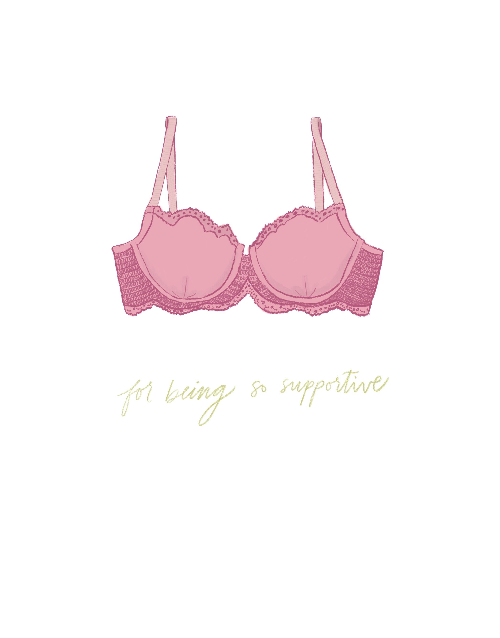
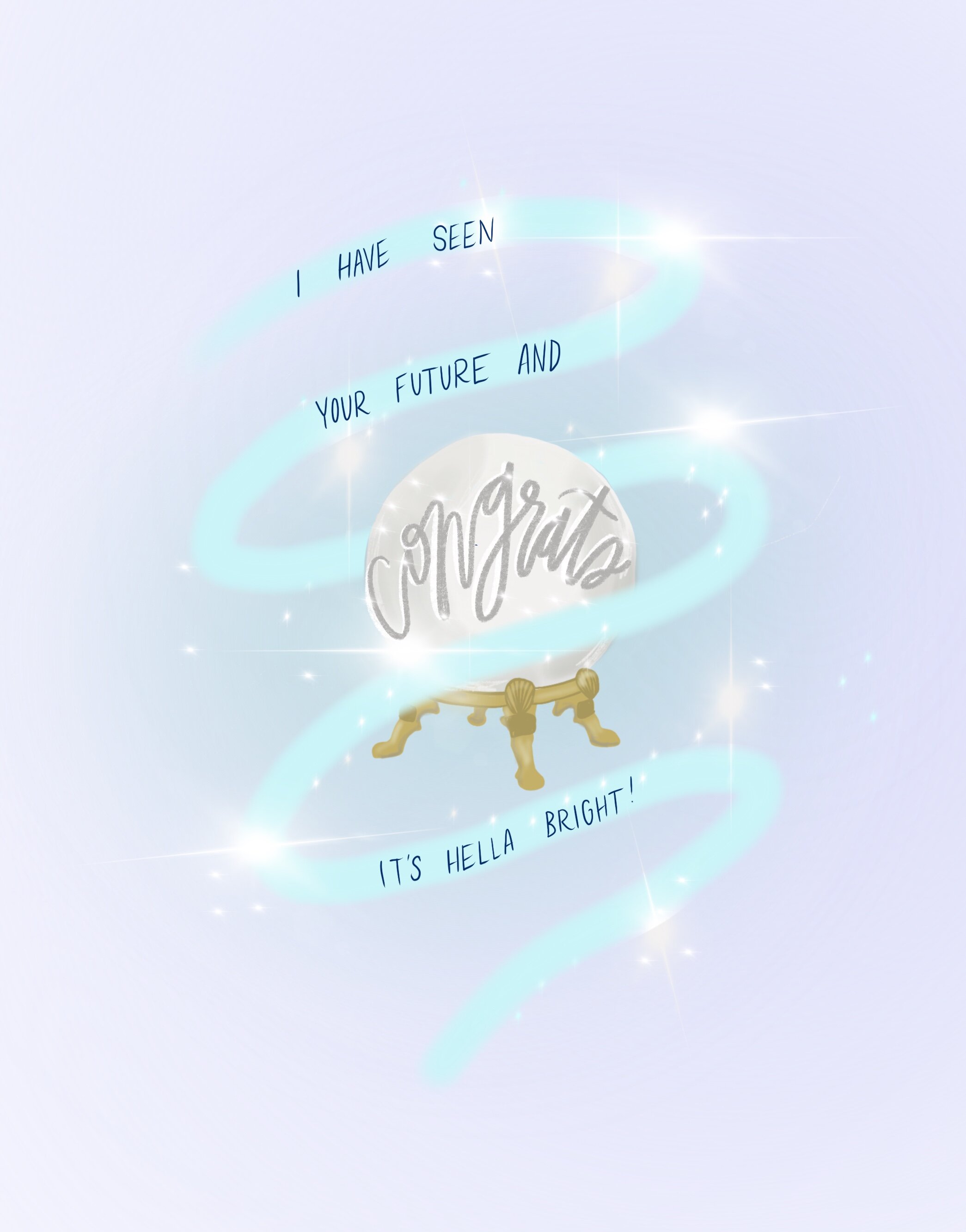
4 Free Valentines For You To Print
I love snail mail. And little notes. So valentines are a favorite format of mine.
I love snail mail. And little notes. So valentines are a favorite format of mine.
All of these are sized to be printed on a 5x7” blank card. Or you can download them and text or email to a friend or loved one. Or you can print them on plain ol’ printer paper and get to cutting.
Hope these make your week a bit more colorful!
xo
em
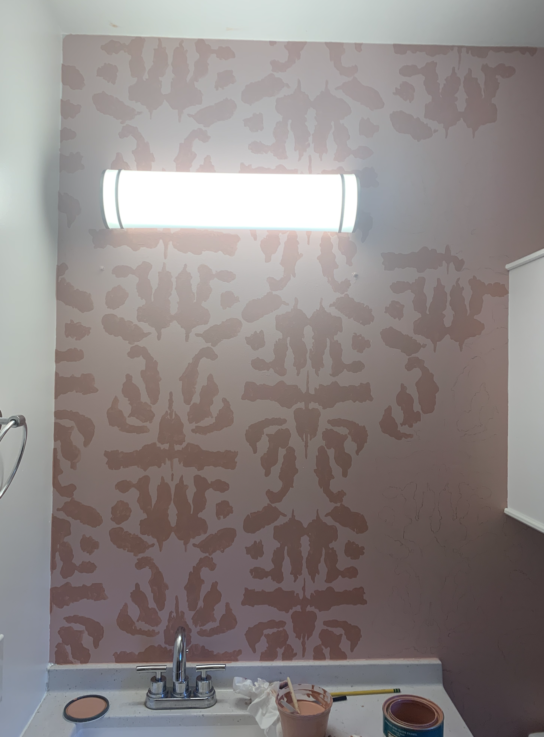
Our Painted “Wallpaper” Bathroom
The process of updating our bathroom (which started as a clean and new but very, very blank slate) started with imagining some kind of fun contrast on the main wall.
The process of updating our bathroom (which started as a clean and new but very, very blank slate) started with imagining some kind of fun contrast on the main wall. I fell in love with some spectacular wallpaper before realizing what an expense and ordeal adding wallpaper to a home could be. Once I read a little more, I floated an idea to Jackson (ya know, the other person who lives here) and Camille (the person I would ask to do me a major design favor): what if we painted wallpaper onto the wall instead of actually wallpapering the bathroom?
Fortunately, they both said yes and we began to explore designs. I wanted something organic feeling. The wallpaper I liked had a kind of feather or scale vibe to it. I liked that, but we couldn’t settle on a pattern that was a good balance of organized and loose. So we kept thinking.
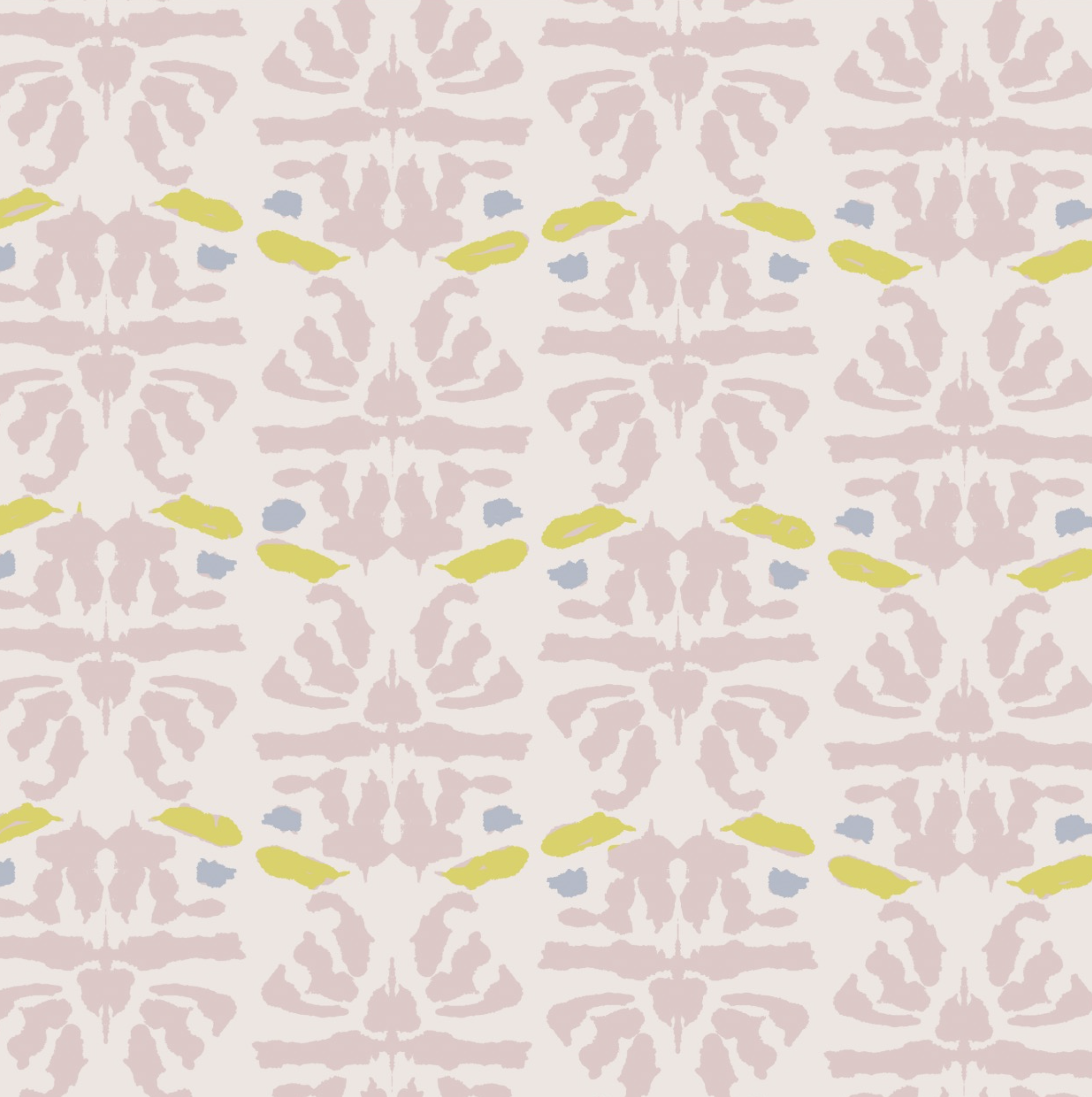
I wanted to in some way match the colors of this beautiful Japanese woodblock print from the 1940s that my Grampa gifted me. We settled on contrasting dusty pinks to give a femme yet sophisticated feel to the guest bath.
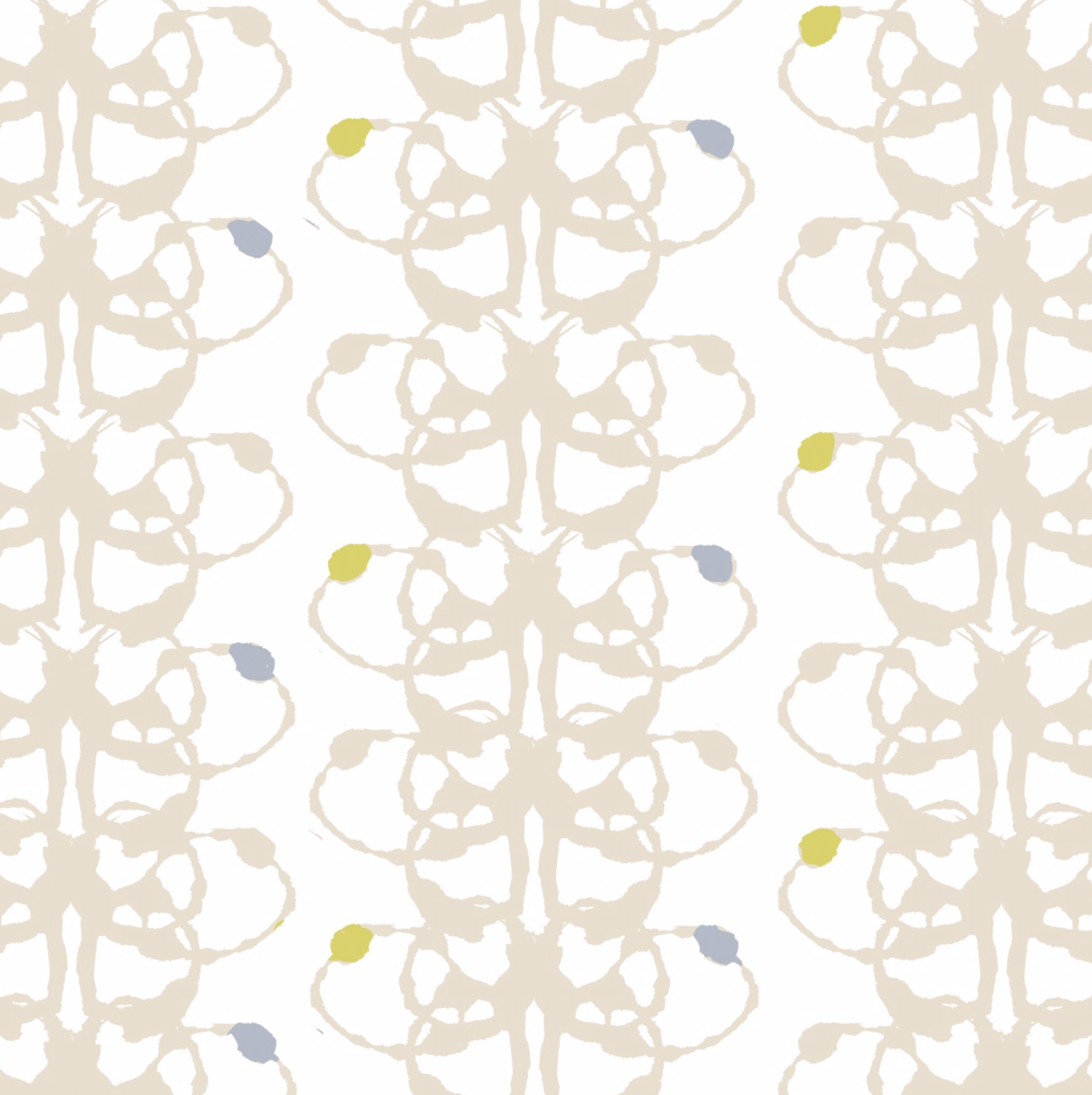
Soon enough, Camille came to me with the absolutely brilliant idea of making some rorschach prints, scanning those, and devising a pattern thereafter. She thought it was a good way to get the organic shapes with some structure since the rorschachs would be in identical halves and we would digitize them and clean them up. We took some pretty pain-staking efforts to get them just right.
They’re available for purchase as digital prints in the shop! And yes, they all have fun names based on what I read into them.
After all the prints were dry, we scanned them at high resolution (1200 dpi) and I began digitally cleaning them. Once all 22 of them were tidied, I started manipulating the rorschachs into patterns and eventually adding colors.
A lot of trial and error led us to a simplified pattern of a single rorschach. No doubt we’ll be producing patterns with them in the future…for, say, some custom “wallpaper” painting templates and wrapping paper perhaps? ;)
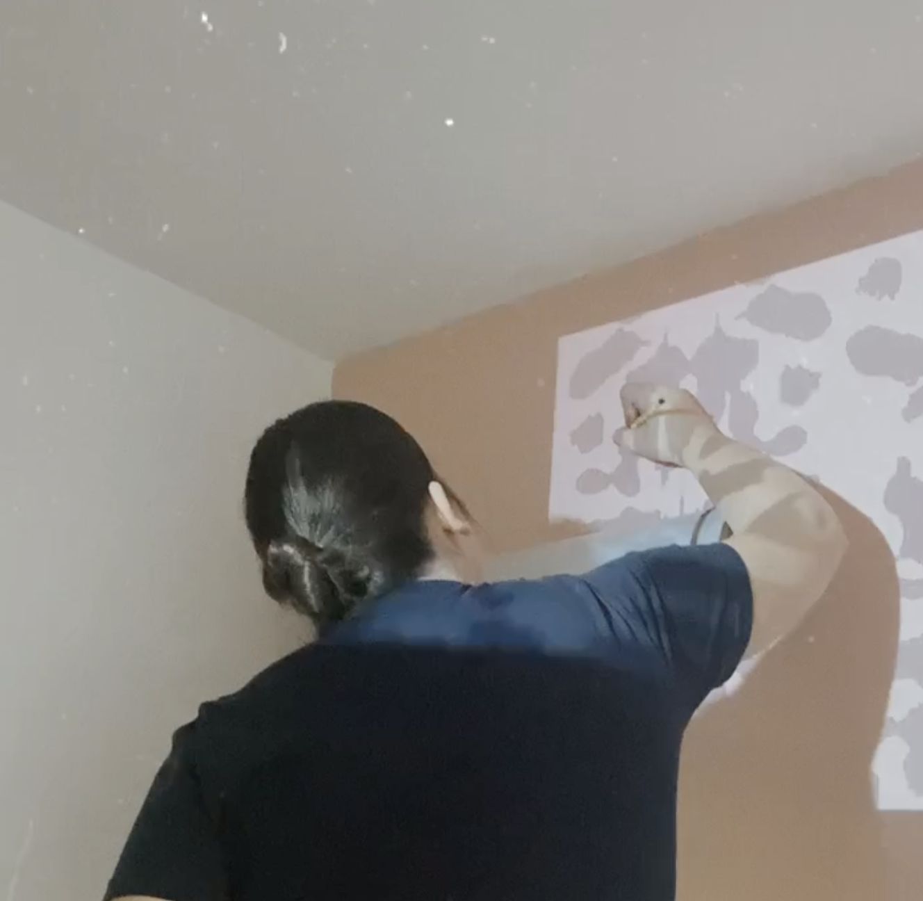
We painted the whole wall the lighter dusty quartz color and then got out a $60 projector and some 5 gallon containers on which to gradually stack it. We drew all of the patterns carefully onto the wall in pencil (which you can erase easily later) and began the process of painting.
And so we were off to the (painting) races! Believe it or not, we used some cheapo IKEA brushes to do all the detail work. I loved how the end result included more texture and variability than wallpaper would have.
I know all the images are of Camille but I promise I didn’t make her do all the work. We had a great time painting together, listening to music, and drinking some beer.
We Bought A House!
On May 13th, we wore our masks into the escrow office and signed 1,342,678 pages with a sanitized pen. We left with a single key to our first home.
[image: A photo of me, the top of a champagne bottle, my dog Potato, and Jackson, who is holding a house key, in front of our new home!]
On May 13th, we wore our masks into the escrow office and signed 1,342,678 pages with a sanitized pen. We left with a single key to our first home. We ordered burgers from Joyland and called utilities companies getting everything set up in our name. We drove to the house, unlocked the door, popped some champagne, and sat on the floor, sipping and dreaming about what we’d put on the walls, who we’d have dinner with on the porch, whether this might be where we bring children home from the hospital.
We’ve been in this process since April 8th when we put in an offer; I was dreadfully sick and in and out of the hospital for the entire month of April. Home dreams kept me powered through finals while sick. It’s a joy to be able to actually share this news!
So this is home now.
I want to be super transparent about something that I think can be unnecessarily taboo: buying a home is a financially burdensome thing to accomplish. This is particularly true for our generation (#millennials, ya know?) and when you have limited income (two doc students in one house means we’re on a budget). We absolutely could not have done this without the generosity and kindness of our family. We are grateful to have people who could support us in transitioning from rent to real estate in order to build our equity while we complete our degrees. This is a privilege and I hope to someday be in the position to help someone else who otherwise would be renting make the same move. We are so, so grateful for you, familia!
We had an awesome realtor, Adam Blevens, and an amazing loan officer (and old friend), Josh Jeans. We highly recommend them if you’re in the Nashville area and you want real people (not a distant company) who prioritize what you prioritize and help make the process as smooth and stable as possible. Thanks you two! (And congrats to Adam and his family who welcomed their second baby girl the week after we closed!)
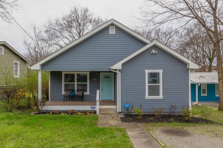
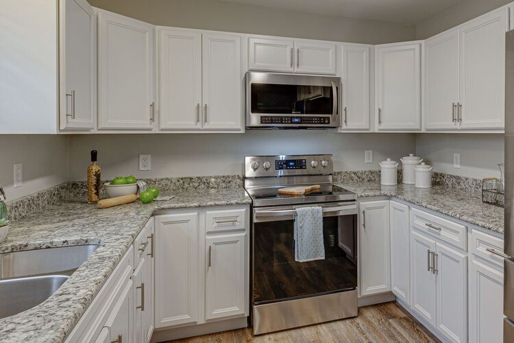
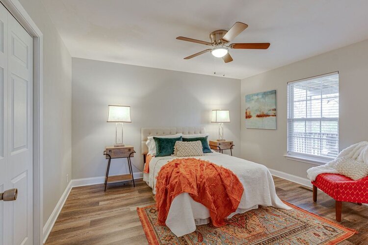
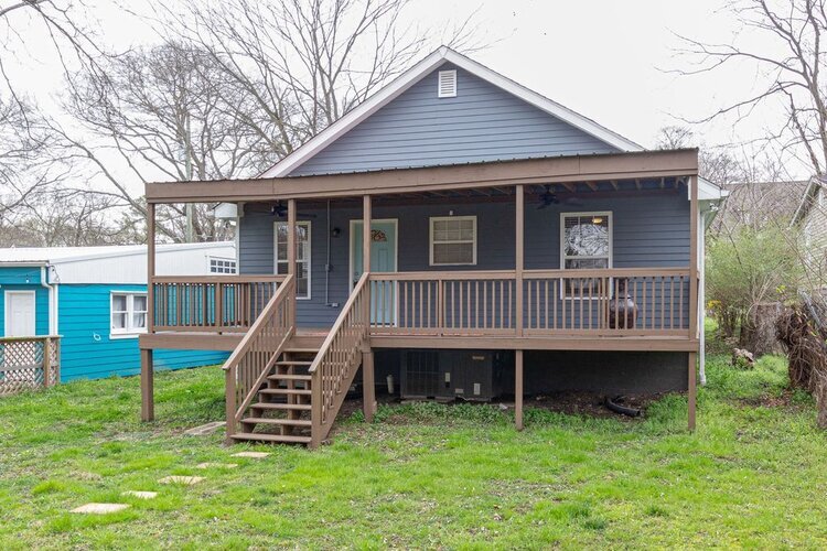
Here are a few photos for now. We will be doing quite a bit of work in terms of painting and redesigning a few things (knocking out a wall?). so stay tuned!
[four images: first, a photo of the exterior of our house which is one-story and blue-grey; second, a photo of the kitchen with white cabinets; third, a photo of the main bedroom, with a ceiling fan, a queen size bed and two nightstands; fourth, a photo of the exterior of the back of our house, which has a porch the width of the house]

Goodbye, wallpaper. Hello, paint!
When wallpaper is too expensive but you still want a pop of color and pattern in a space, painting is the way to go.













![[image: A photo of me, the top of a champagne bottle, my dog Potato, and Jackson, who is holding a house key, in front of our new home!]](https://images.squarespace-cdn.com/content/v1/5fac2dd6ecebbe4cd2cf7f94/1607037240153-NLYQ4Z7YNUIGFAJ9Z7U9/A+photo+of+me%2C+the+top+of+a+champagne+bottle%2C+my+dog+Potato%2C+and+Jackson%2C+who+is+holding+a+house+key%2C+in+front+of+our+new+home%21)
