

Luxurious Bohemian Main Bedroom for under $2k
If you know me, you likely know that I strongly prefer to buy things gently used rather than new. It helps me spend less, it reduces waste, and it usually means I find pieces that are unique and charming. I love Facebook marketplace—it’s the only reason I still have any social media account. I’m also a Craigslist fan, but you do have to be a bit more careful there (we like Facebook marketplace’s built-in social accountability that other sites lack). I also scour estate sales, online emporia, yard sales, and thrift shops looking for the perfect pieces to help bring my home’s style together.
Not only do I really prefer this method of shopping, but I’m damn good at it. We’ve found incredible things over the years, some used and some new, for a fraction of the price they’d cost new or even of their value at a vintage market. Since I only have so much room in my wee house and lots of great finds, I’m sharing them with you, reader.
Can you help me with my home?
The answer is YES. We can help you do “bougie on a budget” too! Since my sister Camille is a professional organizer and stylist and since we do commissioned in-home murals together, if you want to hire us to outfit your home, you can! Drop me a line via the contact page, let me know your budget and goals, and we can get working. For a fair hourly rate for our design and acquisition services, we’ll help make your dream home decor a reality. From painting to making sure you actually print and frame that photo, together we can turn any space into your place.
If you’re in Nashville, we will help coordinate the negotiation of prices on your marketplace items, the pick up of said items, and the installation of your pieces in your home. If you’re not located in Nashville, we’ll do a series of virtual consultation appointments where we help you learn our tips and tricks when choosing your own pieces as well as provide you with a smattering of options in your local market.
Luxurious Bohemian Main Bedroom
Here is a complete bedroom, styled and put together for under $2,000. Spoiler alert: the most expensive thing here is the brand new mattress.
Room: Main bedroom for one or two adults
Style: bohemian, retro, high texture
Colors: grey, black, tan, cream, rust, rose
Materials: iron, linen, wood, rattan, faux fur


$155 Vintage rug bench


Style with black sheets ($45) , cream duvet set ($100), queen mattress ($400), duvet insert ($30), and high quality main pillow inserts ($60).

Style by replacing the original handles with black pulls ($10) and gently refinishing the top veneers.


Style dresser with a lamp on each side and the rattan tray in the middle filled with trinkets. Center artwork over dresser across from the bed.

$180 vintage rattan chair
(from bed)


Style chair in corner of the room with mirror near it against the wall. Snag one of those Anthro pillows from the bed to accompany the two faux sheepskin shag pillows and complete the look.
The grant total: $1,940. The value of this room is estimated at $4,500. That’s a savings of nearly $2600! More than double! So now you see why you might want to give me a call.
Why It Works
Your bedroom should be an oasis of comfort, a place where you feel restfulness wash over you as soon as you cross the threshold.
I’ve paired cozy faux fur with the clean and classic linen headboard and duvet to add some softness to the bed. The iron bed frame frame provides a connection point to the black MCM dresser while adding another textural detail of the metalwork. I would paint the wall behind the bed a charcoal grey to bring some depth to the space. (You could go all grey if you wanted to really make a bold statement while still keeping your room like a cozy cave. Contrary to popular belief, a dark wall color can actually make a room feel bigger, not smaller).
The Persian style rug, Anthropologie spotted pillows, and Southwestern inspired vintage rug bench carry the dusty rose and rust colors throughout the room while each adding a unique twist on pattern. Matching patterns like this can feel risky, but it’s what gives your space a lived in, eclectic vibe.
The MCM dresser echoes the actual midcentury nightstands while they’re otherwise contrasted by color. I would swap out the original nightstand pulls for some black iron ones to match the dresser and the bed frame.
Add some fluffy pillows to your newly found vintage bamboo and rattan chair for a funky, cozy 70s vibe that ties in with the wood of the nightstands and the neutral tones of the matching lamp pair.
Feng shui suggests that we not put the mirror across from the bed, so instead I’d situate it in a corner paired with the bamboo chair. The large abstract art creates a colorful statement over the dresser.
What do you think? Could you see yourself snoozing in this room?
xo,
em

Gemstone Color Palette
Summer brings saturation. Heat pushes us indoors or to water, tomatoes burst with ripeness, and we squeeze the last few drops of extra free time out of our summer schedules before autumn sets in, school returns, and the holidays are upon us.

How To Design a Scientific Poster, Part 1
In this 4-part series, I’m going to be dishing out the design details on how to take scientific ideas and communicate them in a poster without committing egregious visual sins.
There are SO many posters at so many conferences around the world that suffer from confusing colors, lack of structure, too much text, spacing problems, oversharing. I could go on. And I will.
I’ll be walking through several redesigns of a scientific poster that my cohort friends made in 2019 and we redesigned together. We’ll look at the pros and cons of their initial drafts and then examine the changes that we made together to get to the final poster.
By the end of all 4 parts, you should have a grasp on what to consider when you’re first laying out your poster and how to troubleshoot some issues that may arise as you start to add your information. In part 4, I’ll give all my best tips and include a Google Slides with some basic templates.
Instructions I gave my cohort before we started the process:
Pick a color palette. Use the hex code (a 6-digit code that starts with a #) to ensure that the colors match and are consistent throughout. You can use a color picker extension with your browser (for those who use Google Chrome) and select colors from a favorite Pinterest image of a color palette. If you need some inspiration, head over here. You will use the colors to consistently and meaningfully signal related concepts throughout your poster.
Use the central space for your findings. We’ll get deeper into why your poster shouldn’t necessarily follow the flow of a paper, but for now it suffices to say that the middle part of your poster is what will catch most people’s eye first. Put the information you want folks to walk away with there.
Add a QR code. I’ve never seen a poster with too little text. But with the classic problem of too much text, you can get away with off-loading extra documents (e.g. a handout you used for the design that you want to show to poster-viewers) into a Google Folder attached to a QR code. The reason I say Google Folder is that once you’ve made a QR code with a free QR code generator, if you want to change what it links to, a drive folder is your best bet. You can use a cloud host of your choosing, but trust me when I say this solved so many potential headaches as people made edits.
Give your audience a visual representation of your data and/or findings to look at. It can be an image you have permission to use from your research footage or a cartoon-style strip where you reimagine the scene illustrated. It could be a large chart or flow. Whatever it is, it should more immediately communicate the idea of your poster to your audience than the text.
Laura’s First Draft Poster

Let’s start off with what’s great here:
Laura followed my instructions regarding choosing a color palette and putting her findings in the middle. She also has a QR code in the top right corner and has chosen to represent a scene of dramatic improvisation from the research study in stick-figure cartoon fashion for her viewers. Yay! All of these are good things.
Laura color-coded her text as it relates to the colors of the key concepts she flagged (“variation”, “(non)rational subjectivities”, and so on).
Laura’s references are in a small font, since only folks who really want to know the source will be reading that section, and she used endnote numbers to indicate that the text is citing a source.
Can you guess what we focused on changing?
Laura has too much text here. She said as much when she sent it. Most often, when I work with researchers and students who are developing a poster or presentation, the text stays in draft form in a Google Doc until about a week before the product or presentation is due. This helps us make any last minute changes without having to restructure the poster (she can update it live and I can see any changes and make those in Photoshop or InDesign accordingly). Laura wanted some help paring down what she had to know what I felt as a reader was the most important for getting her point across.
The images of the actors are inconsistent in style. Laura told me that this was actually intentional! We ended up keeping this in the final design as the movement from stick figure to outlined cartoon person was representative of the increasing complexity of character development throughout the scenes.
The research questions are currently in two places. We only need to see them when they’re about to be answered.
Paragraph forms of text are intimidating to readers who just walk up to your poster and want to know the gist of the research. Bullet pointing that can reduce the scary factor and invite more folks to read your poster.
Laura’s Edited Poster

You’ll probably notice that this poster immediately feels different. That’s because we created more white space and used blue-grey boxes to delineate that space. We rolled with these cute, simple speech bubbles for the headers because the resonated with the rest of the theme of the research: improvisation and speech.
We avoided outlines at all costs. They’re just boxes that want to be filled in.
We gave ample space between each of the elements. White space is your friend. Too much white space is overkill, but honestly I’d take that over crowded text any day.
We stuck to columns that are about newspaper width. Your brain thinks its reading much faster when it gets to move down lines quicker; hence a newspaper doesn’t print a story straight across the full width of the page, but breaks it up into little columns to make your brain happy!
We used the drop shadow effect and different opacities to add depth to the poster. Your brain remembers what it reads on paper better than it does in digital form. Whether you’re presenting digitally or physically, adding some depth and 3D-ness to your image will make it more legible and memorable.
We moved the research questions to be directly over the findings that corresponded. Duh!
We used the bottom margin of the poster’s white space to squeeze in the references. They didn’t need to be their own squared off section and putting them on the white space makes them feel more backgrounded.
We used all caps for headings to direct the eye. We switched the body text to a serif to add some contrast and complexity to the poster without making it any more crowded.
Clever readers will catch that in this draft, the arrow for “Multiverse/Pluriverse” still needs to be made green to match its box. You’ll also notice that the cartoons were not yet added into this version because Laura was playing around with a few of the figures in a separate storyboarding program before she sent them to me for the final version.
How would you rate the readability of this poster?
Personally, I’d say it went from about a 3 to at least a 7 or 8. Some of the text lines are a little bulky, but in a way that we were ok with when we went to print. You can’t win ‘em all, especially when the words you’re using are super long or you have to explain in-depth a gnarly theoretical concept.
xo,
em

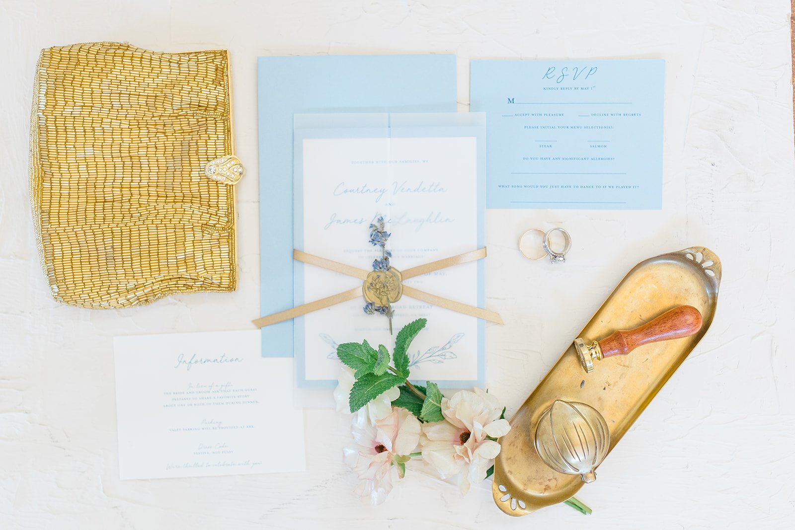
Courtney’s Wedding Invitation
When my mom got engaged, I was delighted that she asked me to do the invitation suite. We landed on a delicate blue, inspired by hydrangeas and lavender, and added antique gold accents. This paper suite featured an RSVP card, pre-stamped response envelopes, hand watercolored envelopes (by my sister, Camille), and an information card alongside the main invitation. The main invitation was, of course, all decked out: two layers of paper for the base, a vellum trifold enclosure wrapped with a gold ribbon and sealed with gold wax pressed into a piece of dried lavender. It looked good. It smelled good. It felt good to hold. Whew! Y’all. This invitation suite: she’s a beauty.
Kimberly Macdonald Photography
Not included in this display—but still a part of the wedding set—was the invitation to the Friday afternoon party at my mom’s long-time dear friend Lynn’s home in Tiburon (if you know, you know…that the views from here are breathtaking). Each square was printed, then the gold stars were hand-painted on before adding the printed vellum layer with a ribbon tie at the top.


The catering from Just Relish was incredible, so the simple, classic style of the menu let the dishes shine on their own.

Kimberly Macdonald Photography

Kimberly Macdonald Photography
My sister—the apparent genius—had the idea to get my mom a Yves Saint Laurent lipstick with her new name engraved on it.

Kimberly Macdonald Photography

Kimberly Macdonald Photography
Place cards and table cards were both watercolored by hand to match the envelopes from the invitations. Yes, Camille did all of the flowers. Did I mention she’s a professional florist?

Kimberly Macdonald Photography

What do you think? Would you include some of these elevated elements in your own wedding invitation suite? We do custom orders!
xo,
em

Bandanas, Baby
I’m working on some new products: bandanas! I love bandanas because of their versatility in use and because of the artistic styles they evoke like classic tattoo imagery, handwriting, repeating patterns. This is my first sketch. Any thoughts on what you’d want to see on others?
xo
bandana em


Kelp à la Matisse

This lil illustration is loosely inspired by Matisse’s coastal shapes from his paper period. I echoed the shapes of beached kelp in the larger bluer pieces, surrounding them with how kelp must look in the water, flowing and gathered. Makes a great phone or computer background!
xo
em

4 Free Valentines For You To Print
I love snail mail. And little notes. So valentines are a favorite format of mine.
I love snail mail. And little notes. So valentines are a favorite format of mine.
All of these are sized to be printed on a 5x7” blank card. Or you can download them and text or email to a friend or loved one. Or you can print them on plain ol’ printer paper and get to cutting.
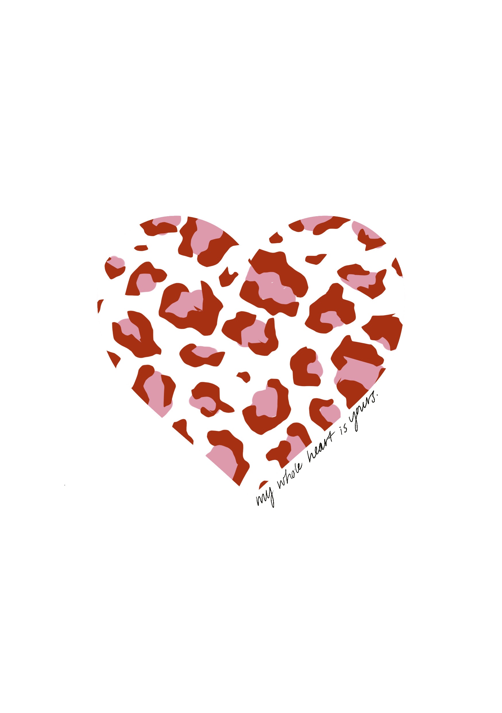
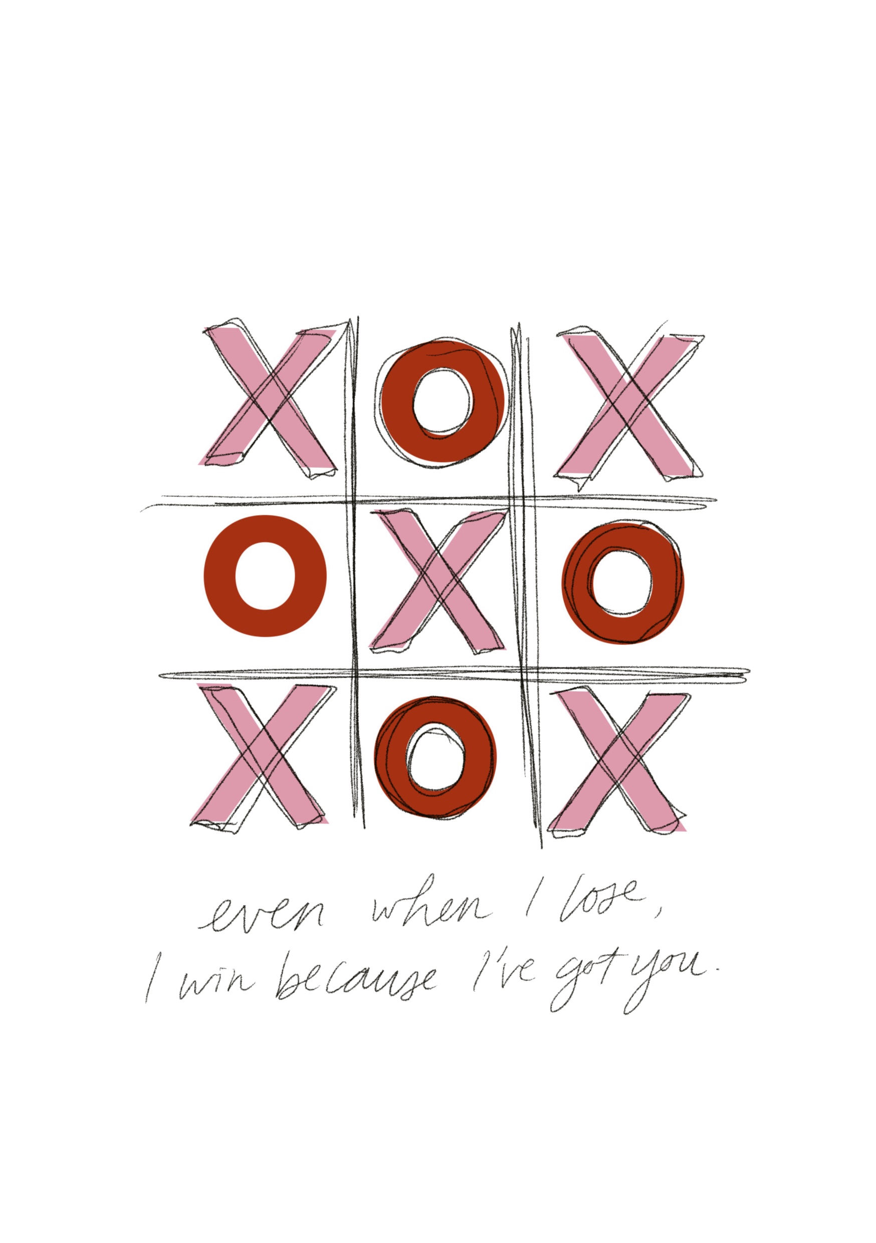
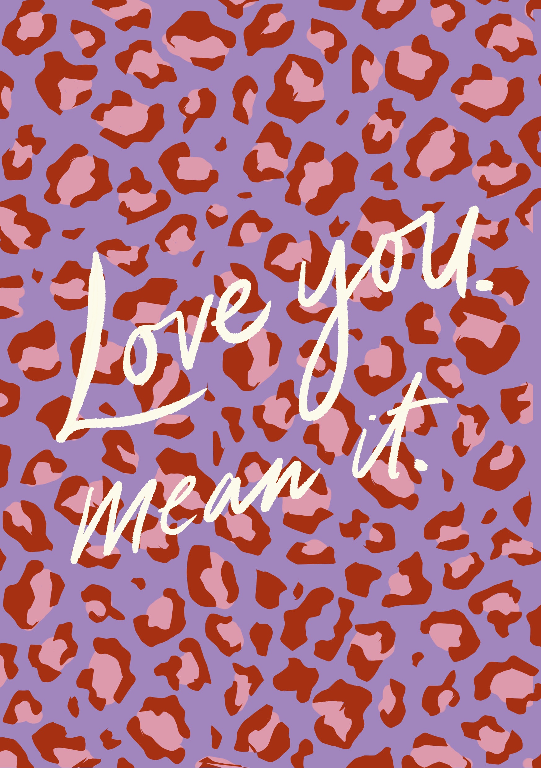
Hope these make your week a bit more colorful!
xo
em

100 Little Steps to Changing Your Life
It’s the baby steps. It’s the little things. It’s the days that add up to years. Grab ahold of your 2020 and set a ONE HUNDRED baby step goal for yourself.
It’s the baby steps. It’s the little things. It’s the days that add up to years.
Grab ahold of your 2020 and set a ONE HUNDRED baby step goal for yourself.
Jackson is going to 100 boxing classes. I’m working out for 100 days in a row.
This free printable will help you get to your goal, so you can see your growth each day. (Yes, just like grade school). Get yourself some stickers, too.


How to Declutter Your Calendar
The start of a new year — heck, a new decade — is a great time to spruce up some of the more regularly used but little cared for items in your digital life. (We’ll get to all those duplicate iPhone photos at a later date).
The start of a new year — heck, a new decade — is a great time to spruce up some of the more regularly used but little cared for items in your digital life. (We’ll get to all those duplicate iPhone photos at a later date).
I lovelovelove my Google calendar. It is an argument-preventer, carpool-enabler, and all-around MVP app on my phone. Because my husband Jackson and I each use multiple calendars for ourselves… and then have to share those with each other so we can stay on top of our schedule, the calendar can begin to look more than a bit hectic. And you know what I hate and don’t have time for? Toggling on and off different calendar views. It’s just not in my time budget. I want to see everything in one place without having to change settings every fifteen minutes.
SO priorities in making over my calendar?
See my most important stuff first. For me, these are events on my family calendar (shared with Jacks) and my own personal commitments. Use: bright colors.
Background all of the stuff that is shared with me (and I want to see for reference, of course), but don’t need deets on. Use: neutral colors.
See some of the optional things like classes offered at my gym, upcoming free events around town, birthdays I need to know for sending cards, and so on. Use: complementary colors that aren’t bright, but still stand out a bit.
Here’s what I came up with for this year. I did a little refresh on the color scheme (yes, you can set custom hex colors for your different calendars in Google Cal) inspired by my 2020 Pinterest board. Loving these 70s ish vibes.
![[image description: a six-color palette with hex codes for updating the colors of your Google Calendar]](https://images.squarespace-cdn.com/content/v1/5fac2dd6ecebbe4cd2cf7f94/1607028407570-5AZ27QYC5G8QDTQ8GGLN/a+six-color+palette+for+Google+Calendars+with+shades+of+red%2C+pink%2C+yellow%2C+purple%2C+green%2C+and+white)
[image description: a six-color palette with hex codes for updating the colors of your Google Calendar]
And… digital drumroll…
Here’s what it looks like when I color coded each of the calendars by their category. My most important commitments draw my eye first. I can easily identify my flexible time for scheduling drinks or lunch with friends. And while I can see Jackson’s calendars, shared departmental calendars, etc. , they don’t drain my visual energy.
![[image description: a screenshot of my own calendar with the color palette in use]](https://images.squarespace-cdn.com/content/v1/5fac2dd6ecebbe4cd2cf7f94/1607028469847-LW141F2R0109XTNAY48A/image-asset.jpeg)
[image description: a screenshot of my own calendar with the color palette in use]
What are some of your go-to tips for managing your calendar? Do you love a digital schedule as much as I do?
xo,
em

Goodbye, wallpaper. Hello, paint!
When wallpaper is too expensive but you still want a pop of color and pattern in a space, painting is the way to go.